
Relying on indistinguishable stock photography and an omnipresent purple gradient overlay, the Kaplan Test Prep brand lacked personality and did not deliver on the internal motto of "quirky test prep zealots". Working side-by-side with the creative director, I was instrumental in the brand's evolution, adding in a human element that put the customer front and center.
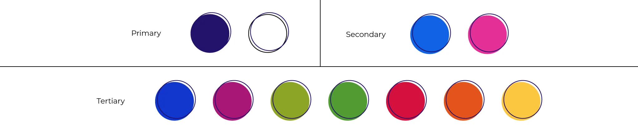
Color Palette
Promotional Banners
Continuing the brand's evolution, new paid media banner design highlighted a cleaner, brighter design, camera-facing images, and smaller brand elements.

Landing pages
Sales landing pages followed the design elements flowing from the promotional banners. Layout went from single color and cramped to open, with lots of white space, mobile optimization, and bright, geometric elements for a pop of color and interest.


Social
Social elements (preview images, social media tiles, social media teasers) also evolved under my leadership, eliminating bland overlays, adding more realistic and lively photography, and eye-catching designs. Clicks, engagement, and conversion followed.


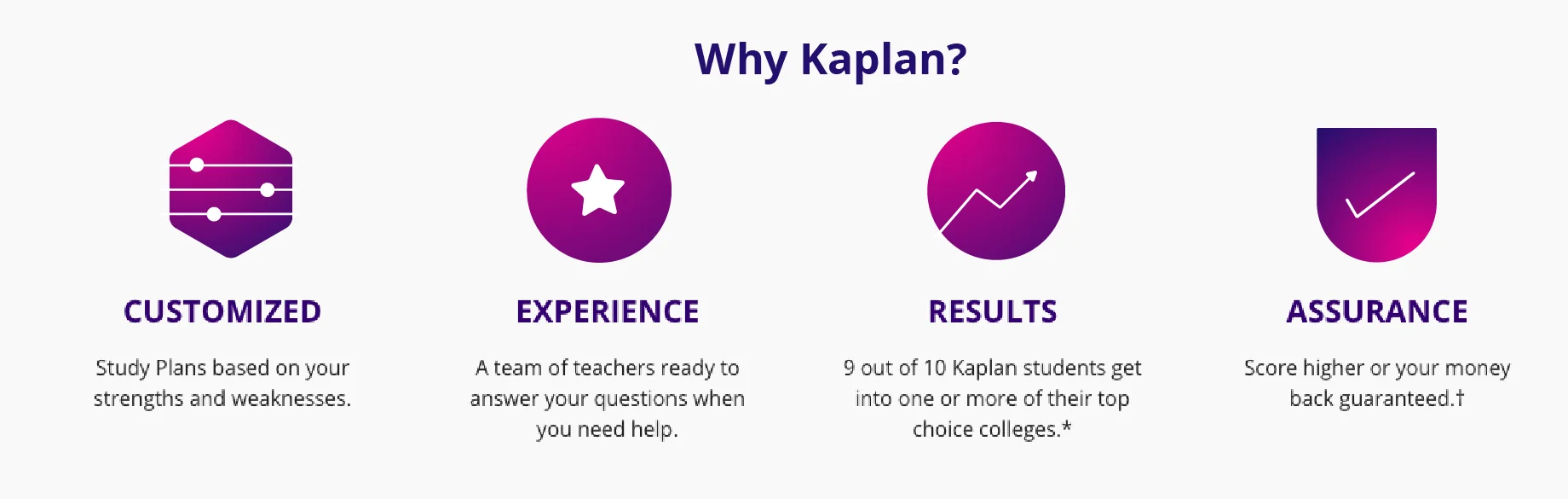
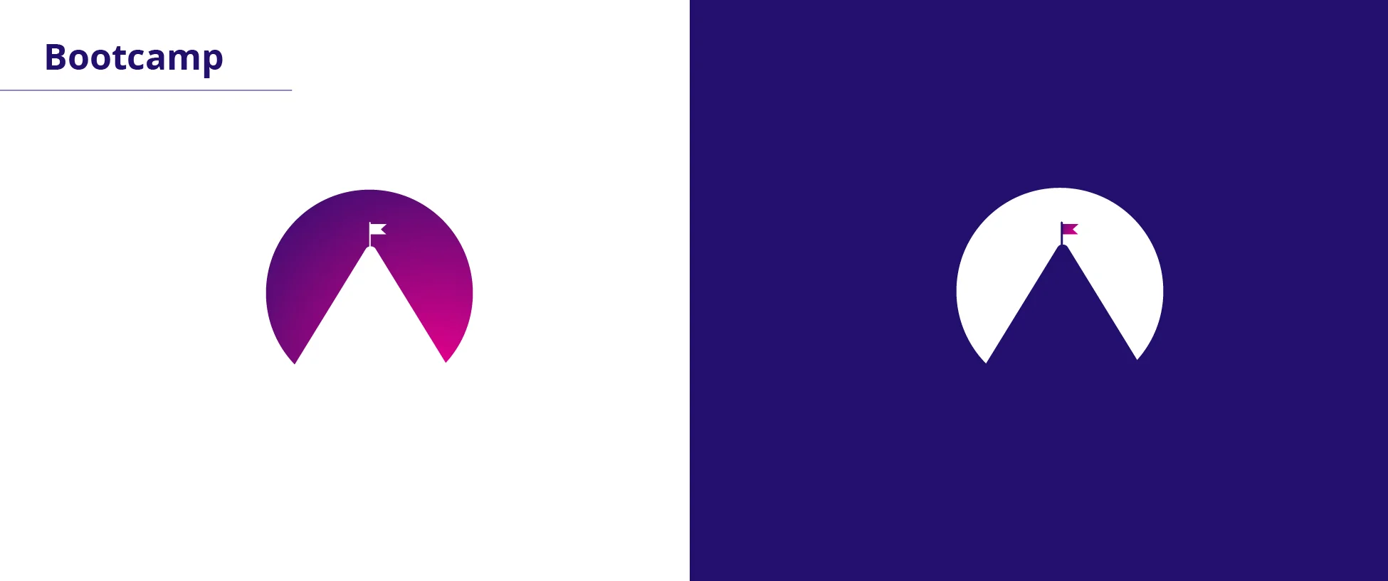
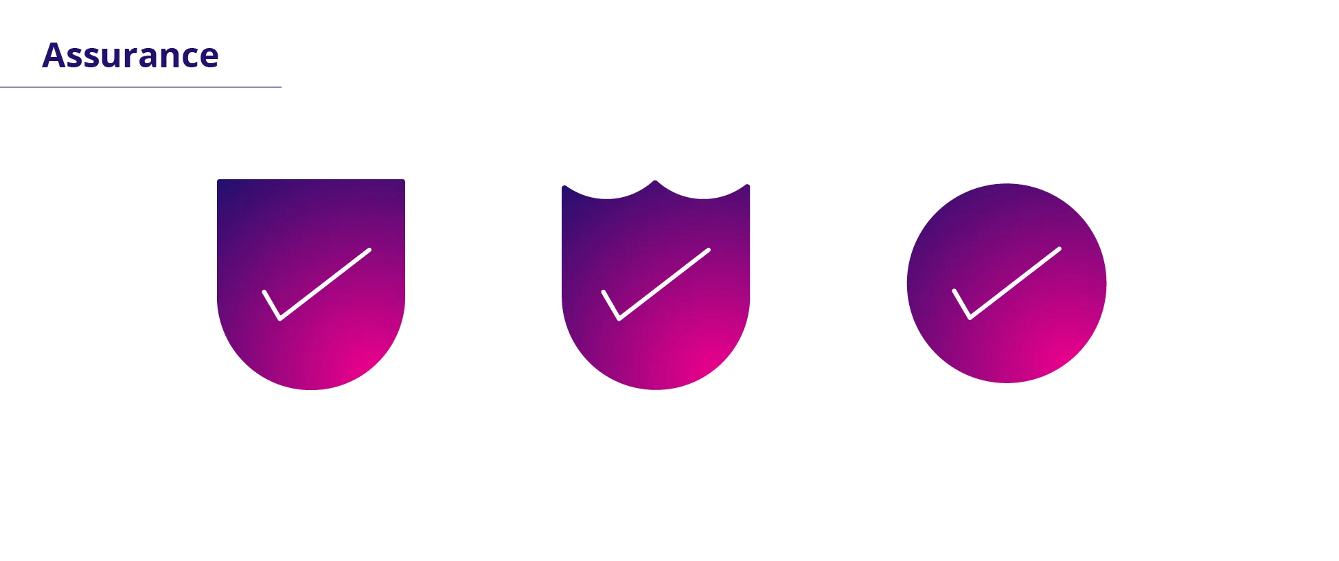
Icons
These are a grouping of Icons/ spot illustrations that i was tasked with creating.


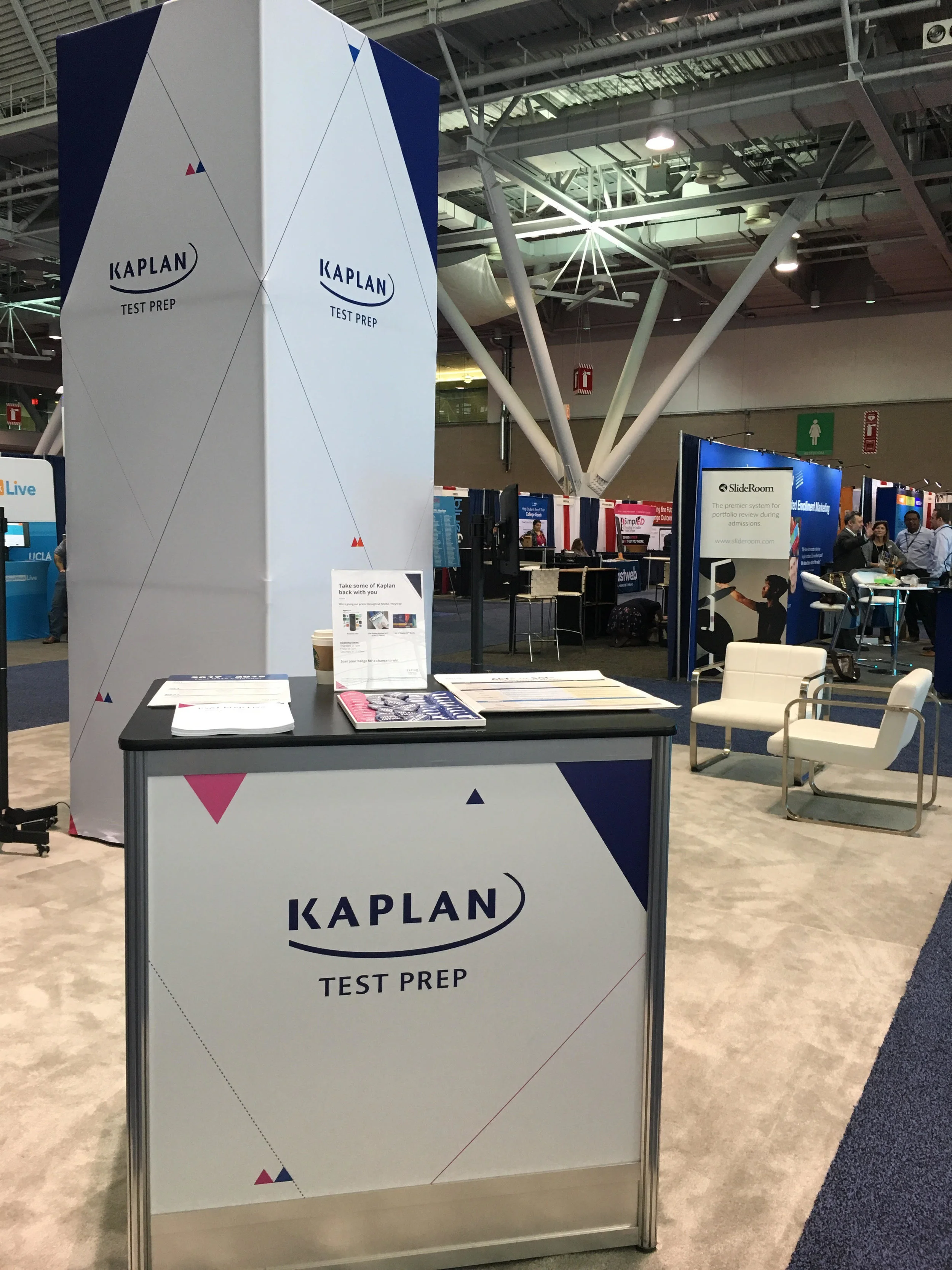
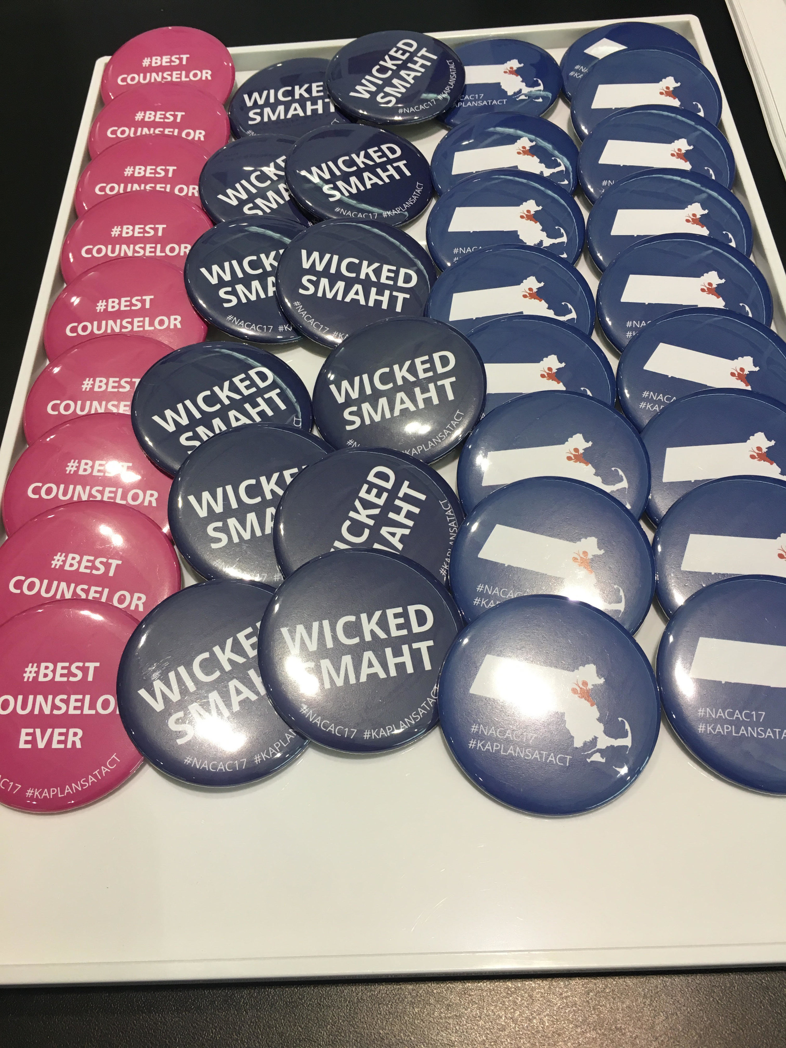
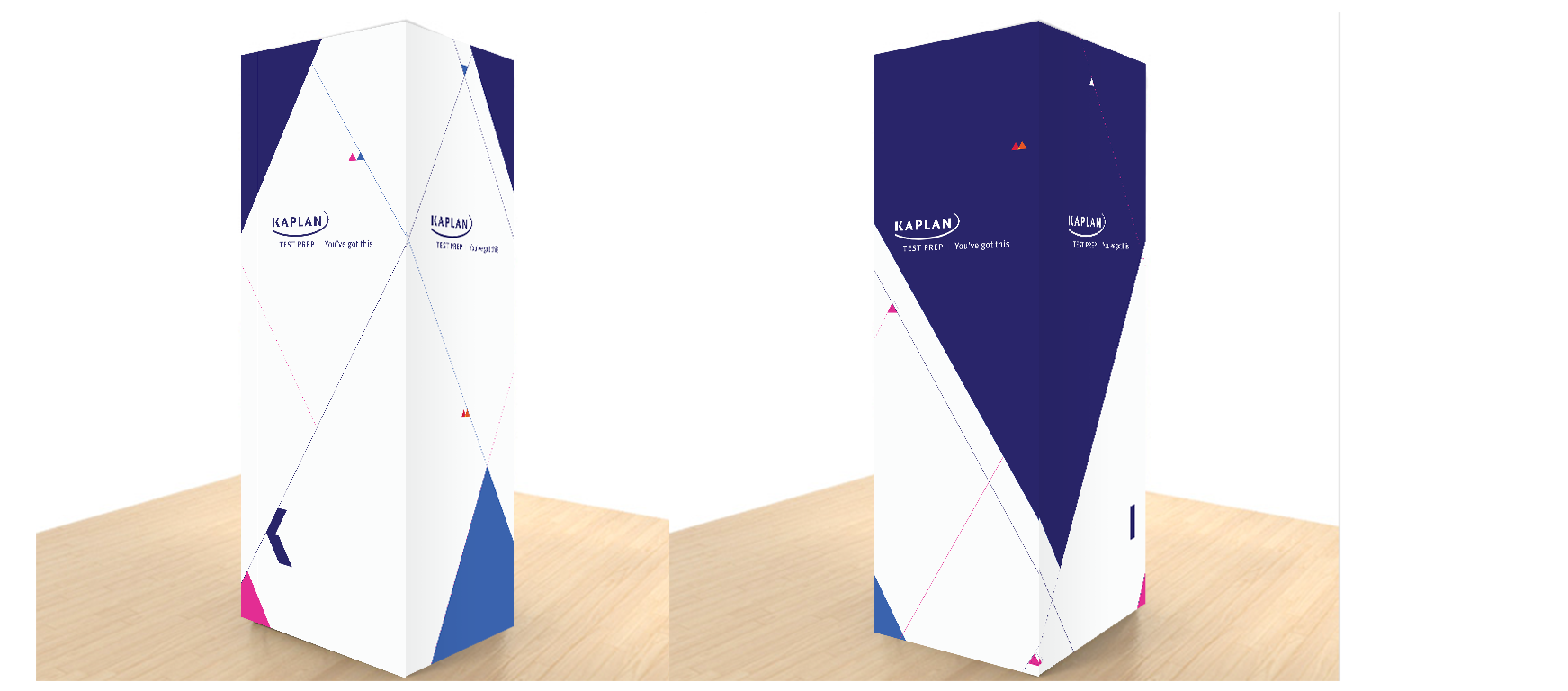
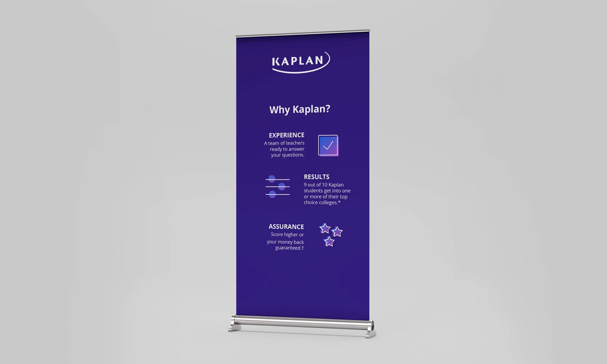
Print/ Events
Print pieces for event spaces and fliers.